Making products happen
Brand identity | Website | Assets

Pitting the work in
Visual identity | Print | Digital
Mooving forwards (sorry)
Brand | Visual identity | Website

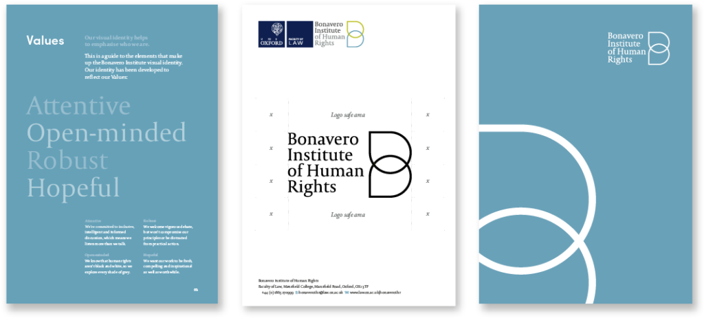
Building an institution
Brand strategy | Visual identity | Brand assets
Right a bit please Hillary 😉
Old meets new meets awesome
Brand | Visual identity
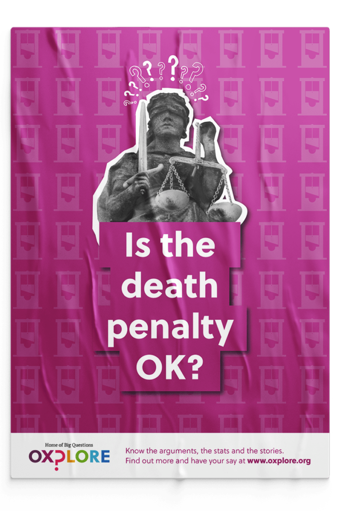
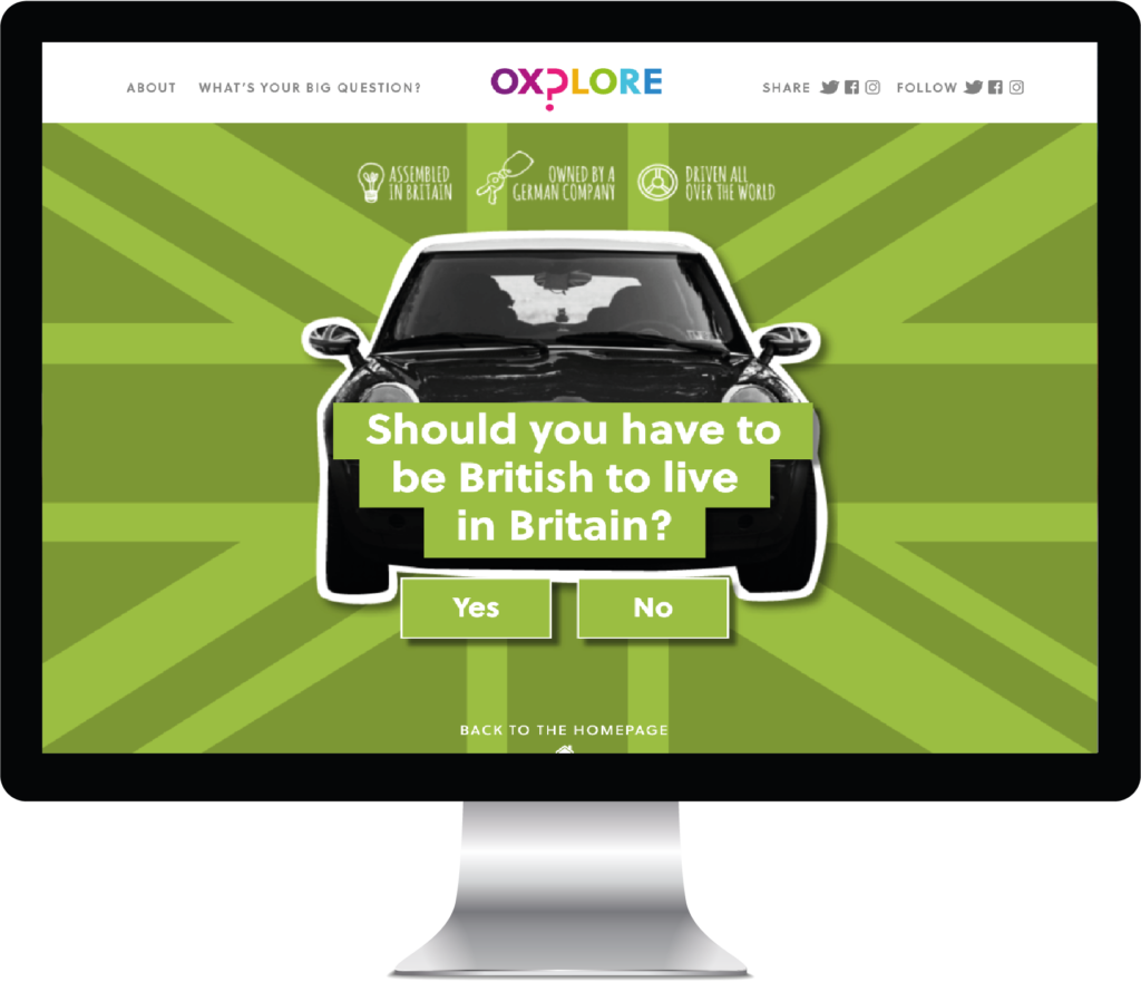
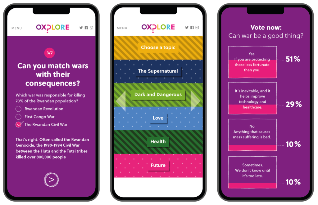
Asking the big questions
Concept | Visual identity | Website | Animation | Content
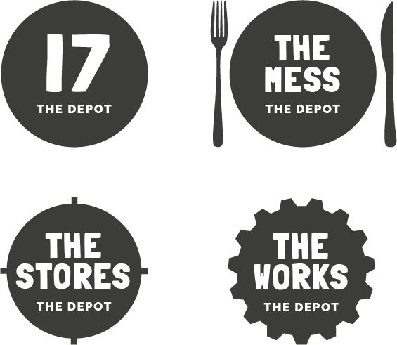
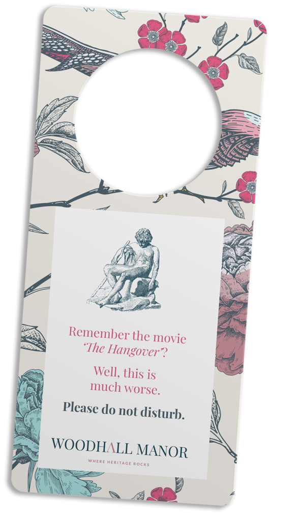
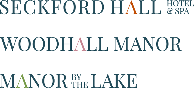
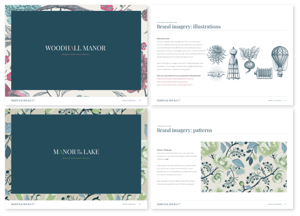
Where Heritage Rocks
Branding | Visual identity
Building partnerships that work
Brand | Visual identity | Assets
Like the cut of our jib?
o
o
o
o
o
o
o
o
o
o
o
o
o
o
o
o
o
o
o
o
o
o
o
o
o
o
o
o
o